What makes a good website design varies from country to country
Making the right decision in design will increase traffic and improve your company’s image. A great website in Europe will be seen differently in Japan, colors and numbers don’t have the same meaning. If users are familiar with your design, they will trust the brand better and stay longer.
So let’s see what the best websites look like in Japan and how to improve yours.
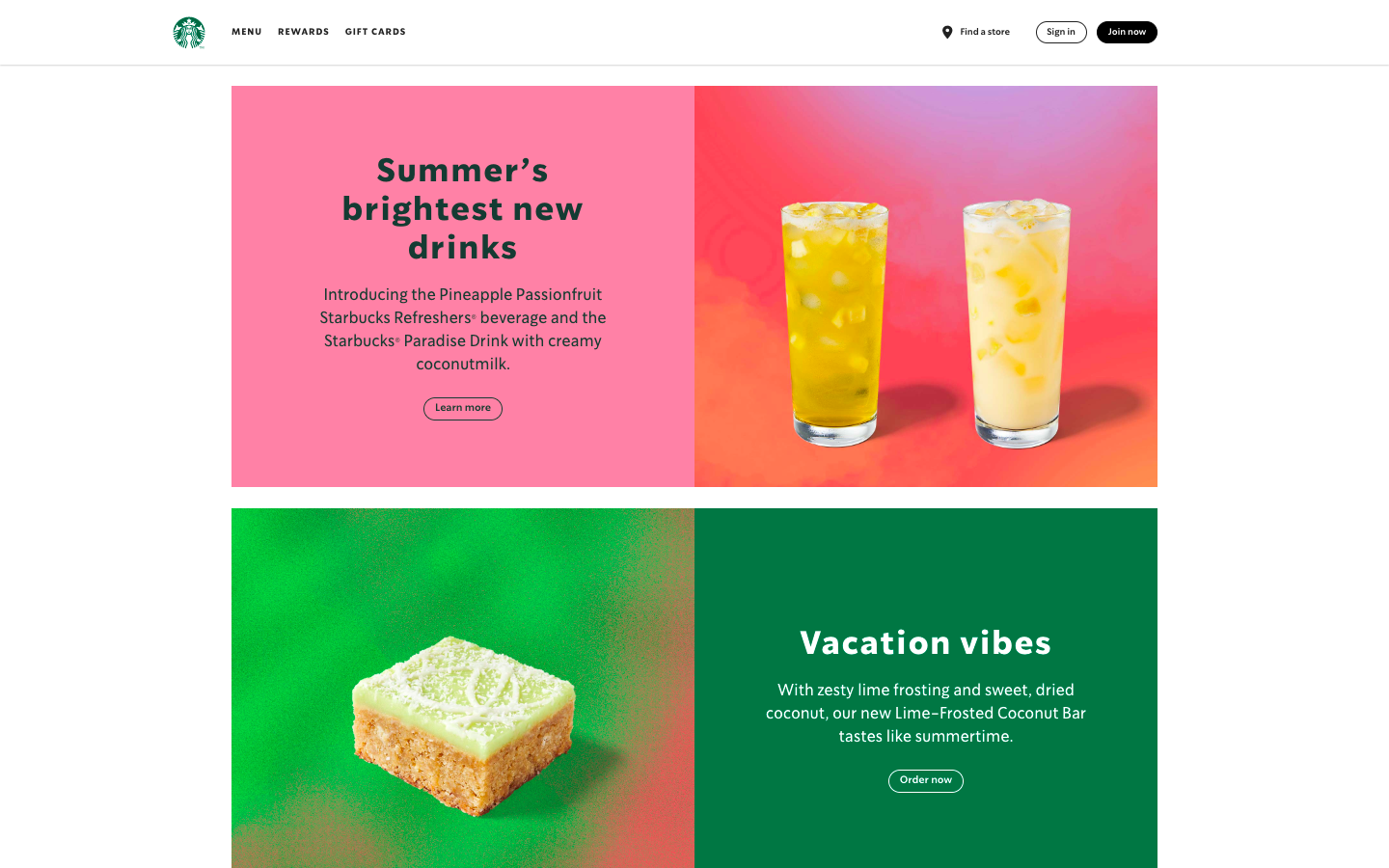
As you can see, this style is more refined with whitespace being filled. There is little to no text at all. Large font for the main information such as titles and drink names. The menu is on the upper left side and the ‘sign in’ button is on the upper right (as usual in the West).
Here, the drinks have brief descriptions of their flavors and characteristics such as creamy, cold, ‘vibrant’, smooth, lush, sweet, etc.). The menu is near the top of the site. There is a “Learn more” to avoid adding too much information on the main page and redirects users to a list as refined as the one before.
In terms of color, one dominant remains dominant: green. Green represents the Starbucks logo as well as having the color of a sunset color scheme for their summer drinks to represent summer. These graphics are large with a similar scheme that more or less matches the drink.
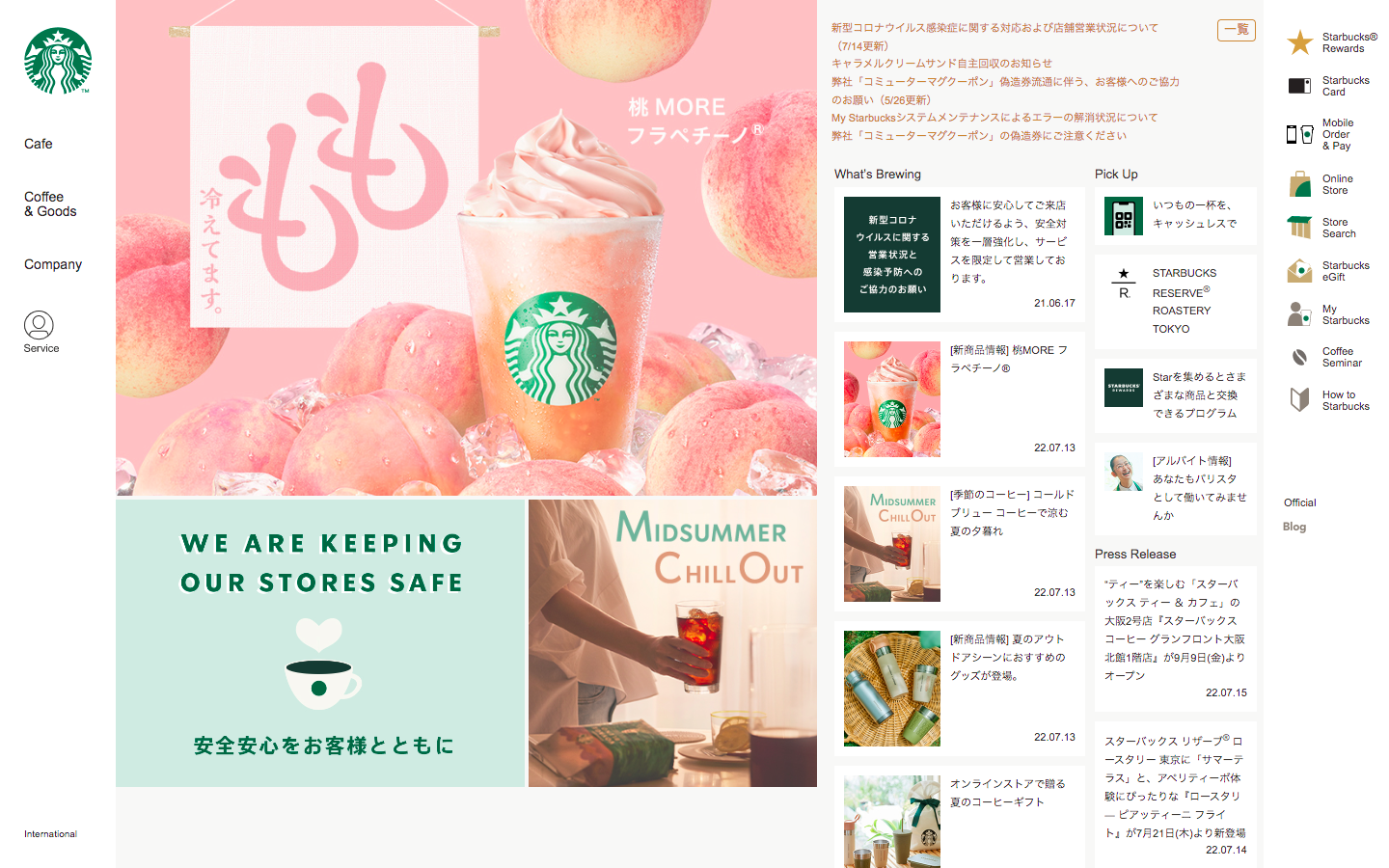
On the other hand, Starbucks Japan is more compact and feels crowded. Only one drink is from their latest release. The menu is two different on the right and left sides for those who are general customers and for those who are members.
There is a news section called “what’s brewing” on Japan Starbucks over to the right side many small news articles to read. These have a short description of the article with the main image to correlate with it. The featured drink on the right side stands out but allows the other text to be readable. While green is also the main color scheme there are complementary colors that are related to the currently featured drink which is peach flavored. Scrolling over to their “What’s brewing” section, each featured article image varies from darker tones, summer videos, and pop of red.
Their logo is a simplified Starbucks green circle and is well-known among Japanese customers. This is similar to having a character or a mascot in Japan to help increase sales. A well-designed logo for a perfectly refreshing drink in Japan’s hot summer weather.
Information is not the same in the two versions, and the drinks are not described on the main page since their names in kanji/hiragana/katakana are enough.
To Recap
In Japan, large text and small graphics are welcome with different colors to display. The website might seem crowded from a nonJapanese point of view, but it represents a lot of importance on one page.
Having a cute character or logo would help get your website recognized since a lot of text and graphics can take over the screen. A study by Akamai.com and Gomez.com also revealed that users leave a website if it does not open after 6 seconds. Therefore, the resolution of pictures is less important.
Visit other Japanese websites to become aware of what users expect when clicking on a link!